-
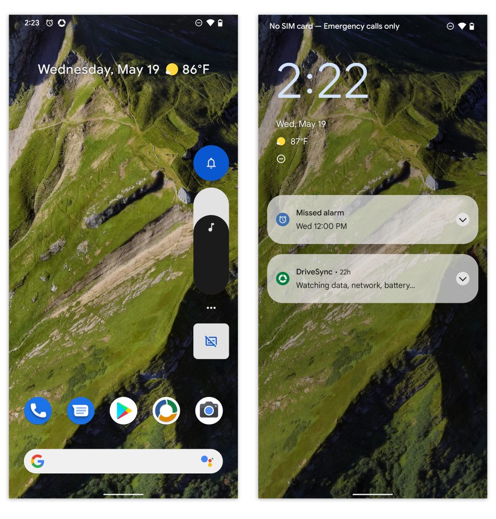
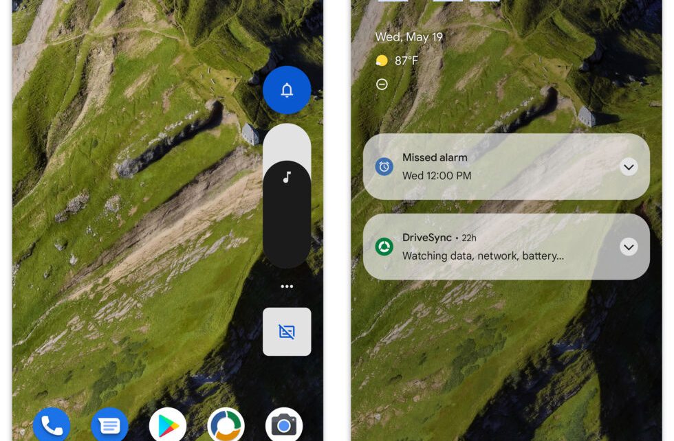
Actual beta screenshots show off the volume controls (which change no colors) and lockscreen notifications. [credit: Ron Amadeo ]
Along with the kick-off of Google I/O, the first Android 12 Beta (Developer Preview 4) came out yesterday. In addition to the usual Pixel release, Google says that OnePlus, Lenovo, Asus, Oppo, Realme, Sharp, Tecno, TCL, Vivo, Xiaomi, and ZTE are all putting out compatible releases for certain models, usually their current flagship smartphones. Android 12 had a major redesign announced at Google I/O, but a lot of that is not present in the beta: we’re supposed to get a color-changing UI, new widgets, and a privacy dashboard. None of that is in the beta yet. You do get plenty of progress in the notification panel, lock screen, and a few new animation effects, but it’s all incomplete right now—as you would expect.
Google’s sizzle reel and mockups for the next version of Material Design, called “Material You,” look great in canned videos and with carefully curated app mockups. But the real question is how quickly and comprehensively will Google implement Material You. If everything quickly gets a cohesive design, that’s great—but if half of Google’s apps are on the new design and half are on the old design, that’s not so great. Dark Mode was introduced in Android 10 in 2019, and the whole Google ecosystem took about 1.5 years to catch up. Google Maps was the last big Dark Mode straggler with a release coming in February 2021, and just when things were settling down, it’s time to change the design again.
Google also detailed ways third-party apps can get in on the color-extraction API that powers Android 12’s Pixel theme. This is something that will probably be cool for smaller apps made to fit into the Android design, but most big third-party developers have been resistant to Google’s Material Design uniformity. After the initial launch with Android 5.0, many of the follow-up Material Design iterations were about “expressing your brand” with more flexible design guidance. That means Facebook still wants to look like Facebook and wants everything to be blue, while Spotify wants to look like Spotify and make everything green and black.
Read 9 remaining paragraphs | Comments