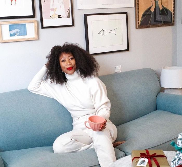
If you’ve ever browsed a paint catalogue, then you’ll know the existential crisis that comes from having to decide between five shades of white that are totally indiscernible from each other and have names like “Savage Ground” and “Mole’s Breath.” This is the situation I found myself in at the end of 2020 as I moved into my new flat and was confronted with the task of choosing a new colour scheme and the accompanying homeware paraphernalia. Do I go maximalist with primary brights everywhere or stick to Scandi neutrals? Do I even bother with a “scheme” and embrace a more haphazard approach? It was hard to know where to start.
But over many weeks of scrolling and pinning, I found that there were three hues that drew my eye time and again: forest green, rust orange, and teal blue. While I certainly wouldn’t consider myself a colour fanatic, I did want to include a few vibrant highlights in each room, be it a painted wall or colour-contrasting lamp. These three shades offered me just that and helped me to create, if not a theme as such, some coherence between each room.
I particularly like the effect of placing brighter pops of colour in front of more neutral walls, such as sage green and orange, pale blue and red. But one thing’s for sure: It’s all very much a work in progress. So if, like me, you’re feeling a bit lost in the world of interior colour trends, allow me to show you the piece I’m loving right now—not a Mole’s Breath in sight.


Up Next: I Just Moved Houses, and These Are the Homeware Buys I’m Obsessed With


