Enlarge / Without significant additional work, the new interface probably won’t please all of VLC’s existing userbase. (credit: CC-BY-2.0 Guilhelm Vellut / Flickr)
Last week, we mentioned that the extremely popular open source video player VLC is getting a brand-new interface in its upcoming 4.0 release, expected to debut later this year. VLC 4.0 isn’t ready for prime time use yet—but because the program is open source, the adventurous can grab nightly builds of it to take a peek at what’s coming. The screenshots we’re about to show come from the nightly build released last Friday—20210212-0431.
Goodbye file-opener, hello media jukebox
-

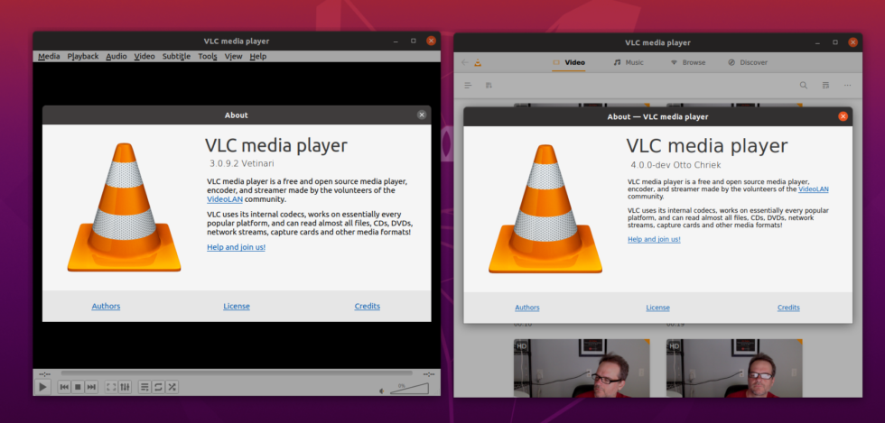
On the left, we have the version of VLC that ships with Ubuntu Focal—3.0.9.2. On the right, we see version 4.0.0-dev, current as of February 12. [credit: Jim Salter ]
When opening up the 4.0 dev version of VLC, the first change that leaps out is an interface shift from “file opener” to “media browser.” In older versions of VLC—from its beginnings in 2001 all the way through the 3.x version being distributed now—it opens to a blank player window, with VLC’s iconic traffic cone displayed in the center. The new VLC instead opens to a media-browser interface, showing thumbnails of all videos present in the user’s Videos folder.
This is the view associated with the Video view displayed along the new version’s top menu bar; it also presents Music, Browse, and Discover. Music offers a similar view into the user’s Music folder, Discover presents a network browser looking for shares and streams present on the user’s LAN, and Discover does not appear to have been fully implemented yet.


