-

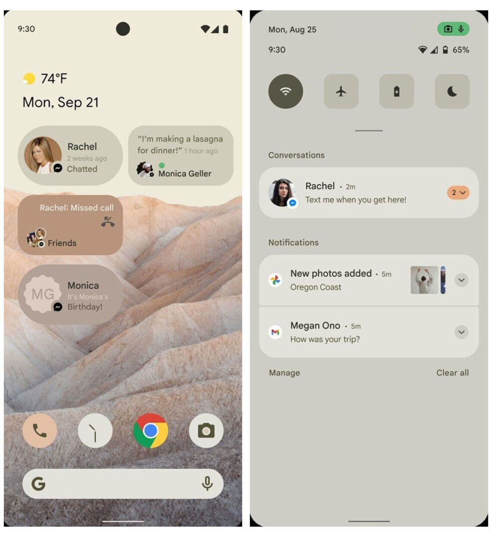
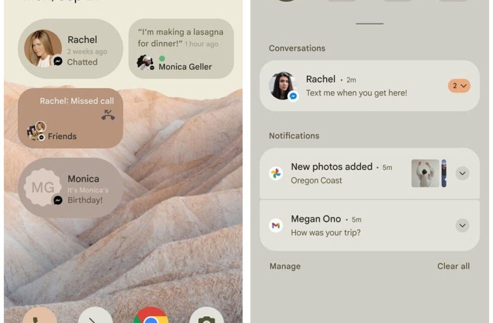
Check out these colors! It looks like they are all driven by the wallpaper selection. A beige-colored wallpaper leads to a beige notification panel, widgets, icons, and more. [credit: XDA Developers ]
The final version of Android 12 should be released sometime in September, but the first developer preview is expected any day now. Our first hint of what Google’s new release might have in store comes to us from XDA Developers‘ Mishaal Rahman, who has some pictures of what looks like a major UI overhaul for Android 12. According to the report, these images represent mockups, not screenshots, of Android 12. The mockups appear in a document describing the new features of Android 12, and the document is being passed around to partners as a heads-up before the public rollout.
The first thing that jumps out to me is the weird sepia-tone color scheme, like someone left night mode on permanently. This color scheme looks like a huge change compared to the all-white color scheme of Android 11, but it’s probably completely up to the user. A recent report from 9to5Google claimed that Google would launch an in-depth theming system in Android 12 that would let the system and third-party apps recolor themselves based on a user’s preferences. One line of the report says, “Interestingly, your Android 12 theme colors should also be able to be chosen automatically based on your current wallpaper. When you change your wallpaper, Android should be able to seamlessly swap to new colors similar to your wallpaper’s color palette.”
It looks like that’s what’s going on here. The UI colors match the wallpaper very well because they are probably from the wallpaper. A beige-colored wallpaper leads to a beige-colored notification panel, icons, settings, widgets, and more. Even the camera app becomes beige. Android has had unused code for a theming engine for a very long time. Automatic UI color picking launched all the way back in Android 5 with the Palette API, when Google started kicking around the idea of using it for a music app. It looks like these things are finally being put to use.


