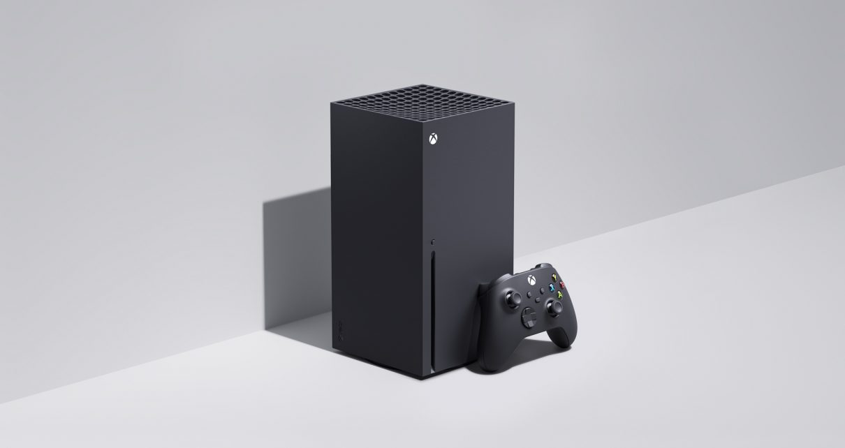
Back in March, we brought you a closer look at the technology powering Xbox Series X, breaking down everything from the technical specs to what next-gen technologies like Xbox Velocity Architecture and Optimized for Xbox Series X mean for players. Two weeks ago, we revealed Xbox Series S and took a look at the technology powering that console. Now, it’s time to take an up close and personal look at the way our new Xbox consoles were designed, sharing some of the process and inspiration that shaped them.
I recently had the chance to sit down with some members of the Xbox Design Team, including Partner Director of Design Carl Ledbetter, Principal Designer for Xbox Consoles Chris Kujawski, Senior Design Director Nicolas Denhez, Senior Designer Ryan Whitaker, and Senior Designer Erika Kelter, to talk through the process of designing two brand-new consoles from the ground up. Simply put, the team has designed the next-generation hardware to power high performance gaming experiences in a way that is more accessible, more flexible, and ultimately to seamlessly fit in to the modern lives and living rooms of Xbox fans around the world.
In developing the aesthetic of these devices, the team was inspired by our partners on the Xbox engineering team, modern technology, and the legacy of previous Xbox gaming products. Xbox Series X and Xbox Series S were designed to fit in anyone’s home; they are architectural in nature, have personality and a visual appearance that the team believes will stand up over time. The consoles become the physical representation of a quality experience that will pair with any style and game type. Most importantly, they can stand out or disappear into the environment they’re placed in based on our fans’ preferences.

“In many ways the process used to design these products typify the way we build all devices. Hardware Design at Microsoft has evolved from small teams working independently across campus from one another, to now sitting in one studio that creates every Microsoft device from Xbox to HoloLens, Duo to Surface Hub, unifying our hardware language while maintaining the personality each product deserves, said Ledbetter. “Design also now works seamlessly across Hardware and Software, building digital experiences in tandem with the devices that enable them. It’s the way products that people love are made.”
Designing from the Inside Out
In September of 2017, the design and research teams went out and visited our customers, bringing with them some prototype form factors for what would become the Xbox Series X. What they found when sharing their vision of what a next generation console could be was that gamers were most excited about something that felt new and different, but also easily fit into their homes wherever they played. That drove the team to design consoles that were as compact as possible, with small footprints and the flexibility to be placed in multiple orientations and spaces.
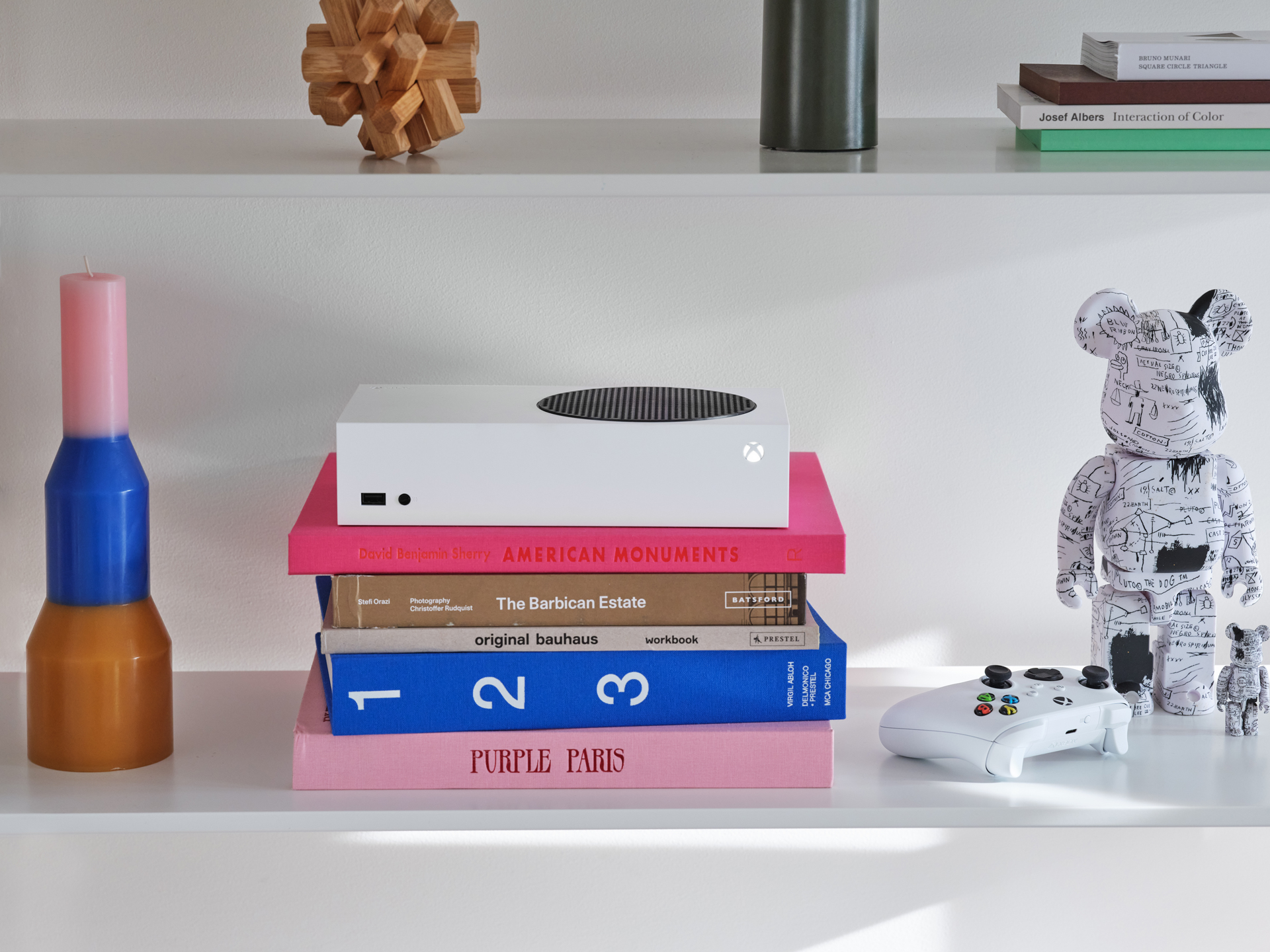
The Xbox Series X and Xbox Series S are different shapes, sizes, and colors, but both can be used horizontally or vertically without an additional stand, and the Series S is small enough that it can be easily transported around the house or to a friend’s, which is something customers told us was really important as well.
“The design process at Xbox has always been deeply rooted in the collaboration between the engineering and design teams. To deliver the most efficient and compact form factors, the teams spent months prototyping and simulating different architectures,” said Kujawski. “It was the combination of that work and an eye to how customers would place the devices in their homes that we landed on two unique and iconic forms.”
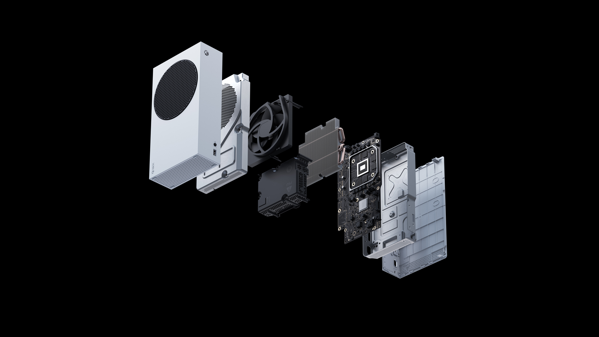
For the design of the Xbox Series S, the team took the opportunity of designing a console for digital first gamers to rethink and reshape the overall form of the device, with a laser focus on making it the most compact Xbox ever. Although the internal layout leverages many of the efficiencies developed for the Xbox One S, by reshaping the power supply and removing the disc drive, the Series S is 40% smaller than the One S.
We intentionally chose to match the depth of the Series X- the original ID concept was nicknamed “Slice” because it was literally a slice off the side of the X- to imply a family relationship as well as achieve the same accessibility benefits when it comes to attaching cables. And we weight balanced the components to ensure it was stable in horizontal or vertical orientations. The result is that the Series S will fit on a much shallower depth of shelf, as little as 8” is needed, including the power and HDMI cables.
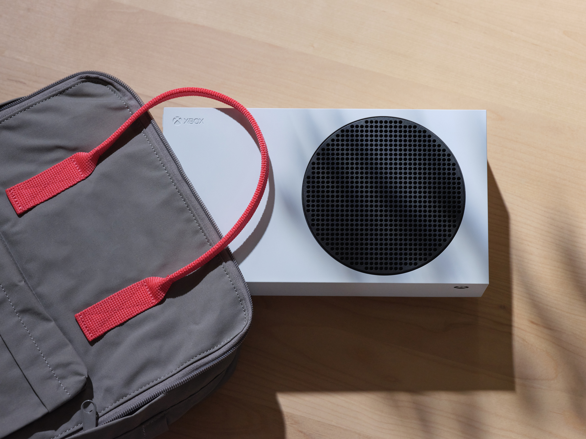
Designing in this flexibility gives our customers options on how they configure their gaming setup- the compact nature of the Series S means it will fit in, and travel more easily between, more environments than any Xbox before. It easily slips in a backpack or small bag and lets you take a next generation console quality gaming experience with you.
The team got lots of great feedback from the customers they shared the Xbox Series X prototypes with, so it was time to dive into the work of solving the technical challenges that came with it. Xbox Series X features the most powerful System on Chip (SoC) ever from Xbox, and creatively cooling that chip with a single axial fan is what unlocked the solution to the form. By splitting the motherboard in half and bolting each side to the central aluminum chassis, the team was able to pull a huge amount of air through the entire system at a low enough acoustic level to keep the console running quietly and efficiently.

Ultimately, the size of the fan set the dimensions of the device, and the teams worked the proportion of the enclosure around the other major components to achieve an almost exact 2:1 ratio of two cubes stacked, which became the basis for the geometric identity of both consoles.
The team found that the small, square footprint of the console lent itself to being set up in a wider range of spaces than a traditional console, too. The shallow depth of Xbox Series X makes it easier to access cables in the back and the team added tactile indicators to the rear IO to make plugging them in even more accessible and easy. Although initially designed to sit in its most heroic, upright stance, at just under six inches tall when placed horizontally, Xbox Series X will adapt to most living room shelves and furniture as well. The design team took it home to test it themselves.
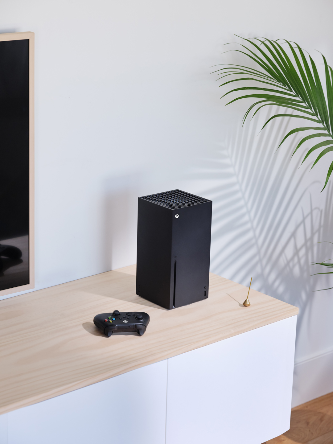
“The Xbox Series X and Xbox Series S are both the result of listening to our fans and designing for them the most optimized consoles to deliver next generation games. We know we have a wide range of customers and giving them choice was critical; we didn’t want them to have to choose whether to get next generation experiences though,” said Kujawski. “Both consoles have the components to enable the Xbox Velocity Architecture to deliver high-quality visuals, super-fast load times and innovative new gameplay scenarios. The consoles were truly re-imagined from the inside out to exceed the expectations of both our current and future fans.”
Intelligent Geometry: A New Approach to Console Design
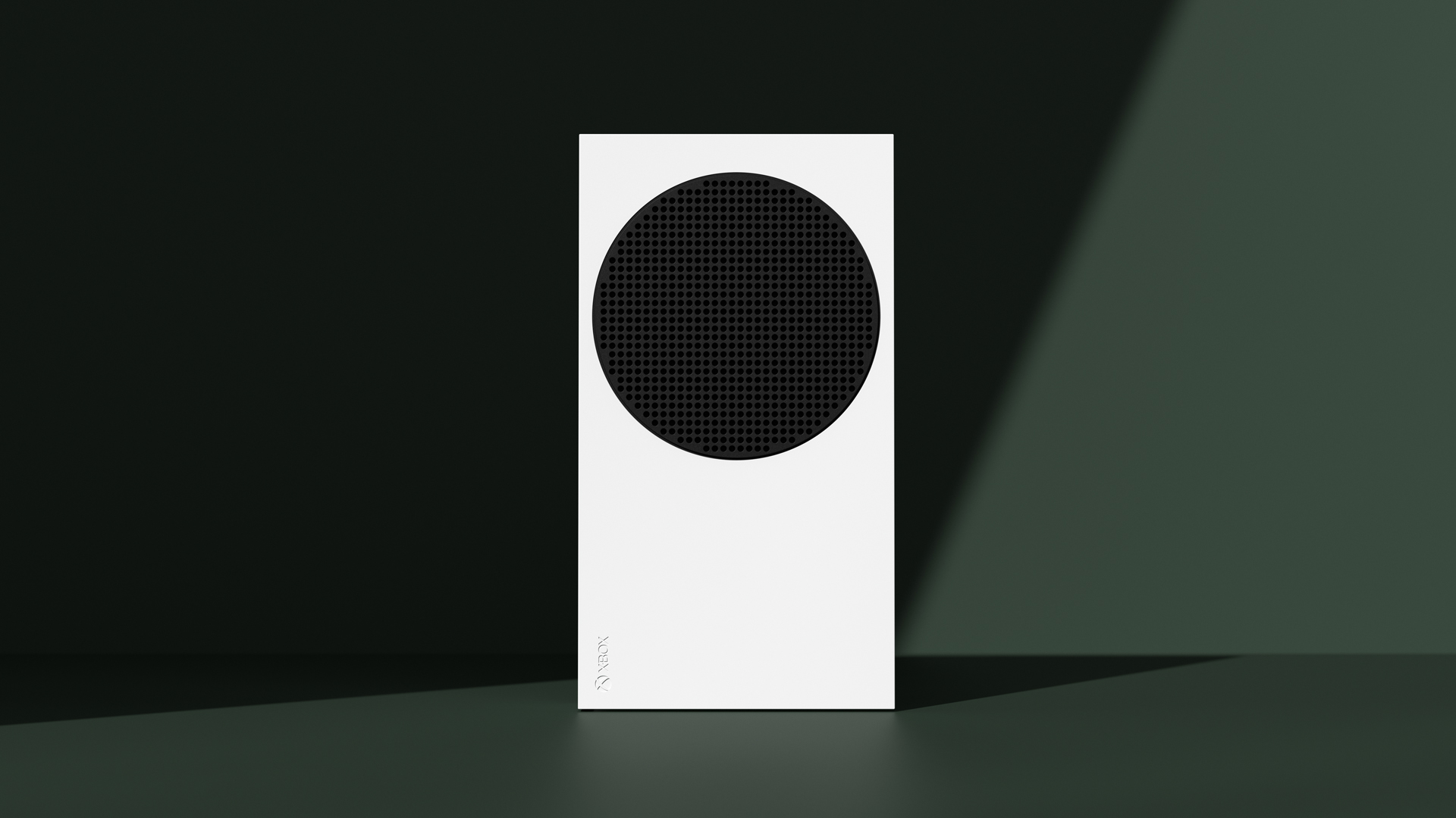
At its root, product creation begins with defining the basic form, driven by functional requirements to power next generation games and experiences. The team designed the enclosure of each console to support functionality in a way that is pure and true to the internal components.
The user touchpoints create details that are graphical in nature and form a system that is highly adaptable and morphs from device to device, while retaining a consistent design lexicon. To put it simply, the two consoles may look different, yet they still feel similar. The geometric forms and bold details of the products lend themselves naturally to being expressed with 2D elements and gives the devices their aesthetic and personality. The team named this approach to console design “Intelligent Geometry.”
The team’s goal was to distill the elements of the designs into something simple and memorable that could be sketched out in a few lines or shapes – the black circular vent on Xbox Series S, the grid of circles and insert molded disc drive detail on Xbox Series X, or the iconic silhouette of the controller. These elements combine to create a shared language that has evolved over the past generations of the consoles into something distinctly Xbox.
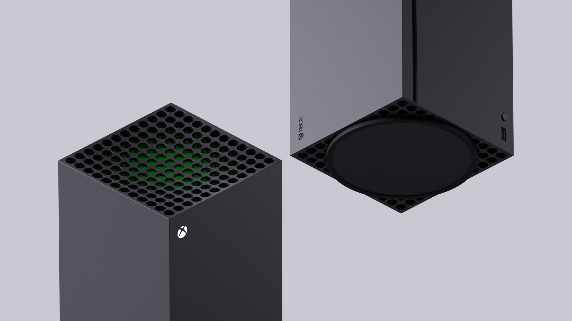
“As designers we aspire to create products with visual impact, but we realize that most gamers buy an Xbox to play games, not just for its aesthetics,” said Denhez. “We know we must build products that have longevity and will belong in people’s homes for years. By creating a silhouette which blends into the environment, the device earns its place in living rooms and beyond without feeling foreign and obtrusive.”
The Design is in the Details
While Intelligent Geometry was a new design methodology, the team was very conscious of the fact that adopting a form language based on primitive shapes runs the risk of feeling basic. Adding depth through layers and details is what brings life to the object; being very considerate in choices around color and material and executing fit and finish at an extremely high level are ways the team elevated these devices to feel premium.
Staying true to the principles of Intelligent Geometry, they also highlighted functional features in a bold and memorable way, using the same family of shapes to build consistency across the two distinct products.
One thing the team often does in their design process is use color and material choices to accentuate the architectural and geometric approach. At a large scale, the primary design element on the Xbox Series S is the circular, black exhaust vent on a field of white. That boldness gives the console personality, but the contrast between those parts also diminishes the visual impact of the actual ventilation holes in the enclosure, resulting in a simplified look for a potentially complex element.

The white and black color scheme also works for tying the console back to the previous generation, but its high contrast treatment feels fresh. The color combination also works well with either of our next-gen controllers, giving gamers choice in how they accessorize. You can place it in a shelf and make it basically disappear or celebrate the design and place it in the middle of your living room. The small form factor and the dual-color venting detail approach really works in this white-and-black scheme.
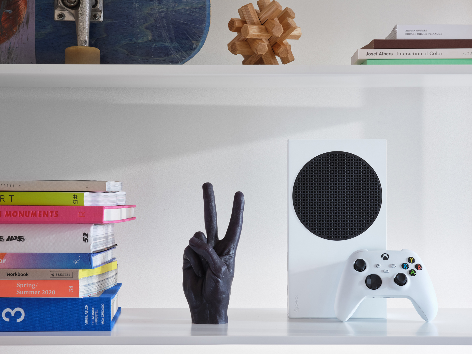
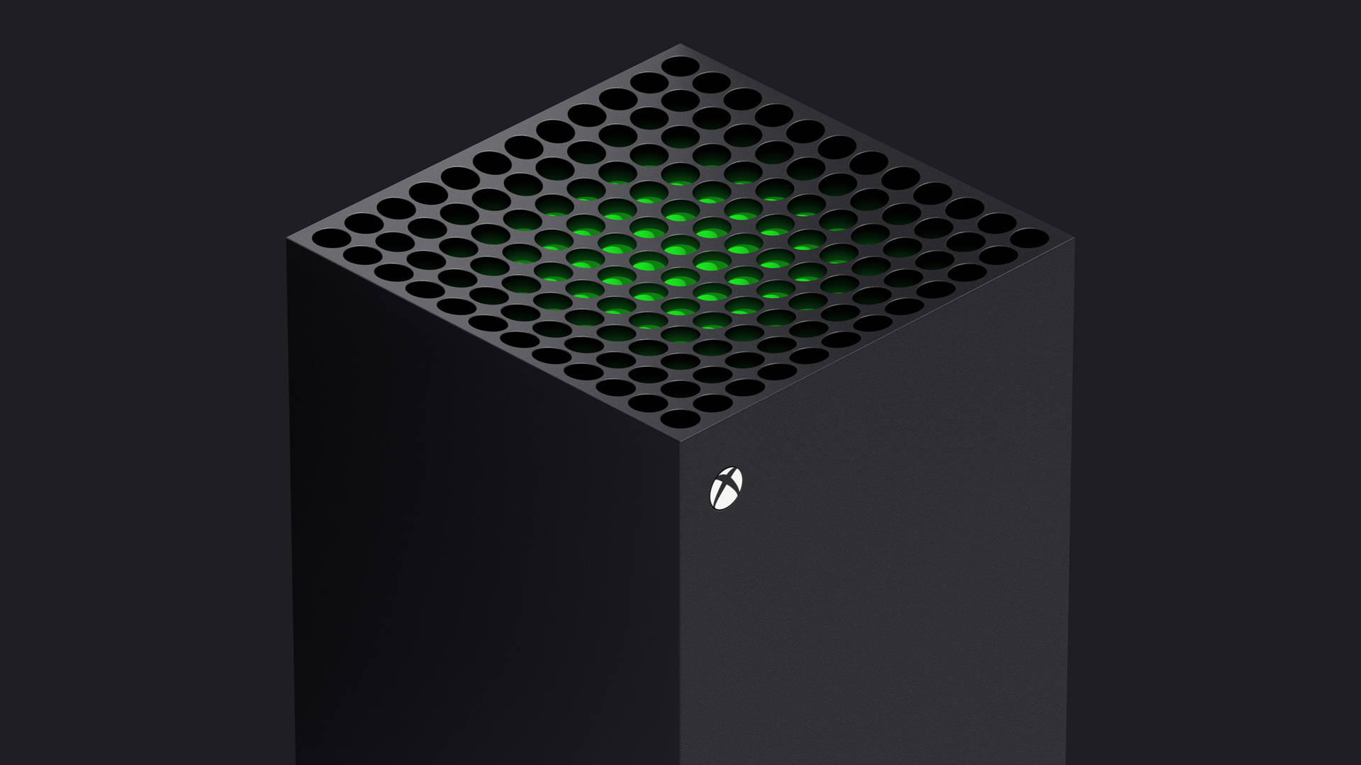
As for the Xbox Series X, the exaggerated size of its vents are functionally driven, but the design team embraced the scale of the openings to make them the signature element on the device. It was there that the team worked consciously to develop the second “read” of the device: when the first impression is simple or primitive, the second read becomes even more important.
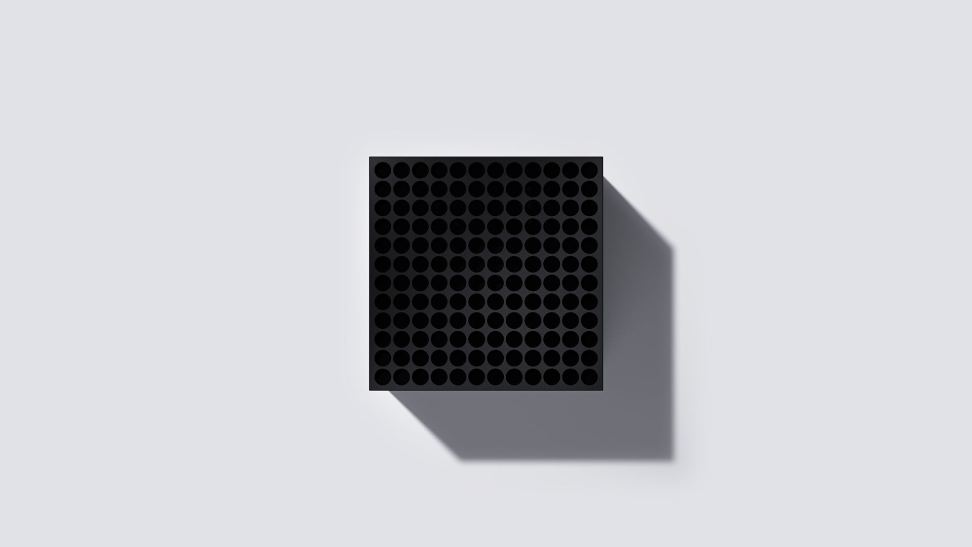
The second read invites the viewer to come closer and explore: the green accent layer underneath the venting on the Series X is a great example of this. The team wanted to draw the user’s attention to the venting as the primary design element and wanted to infuse Xbox green into the core of the design, not just as a decoration.
“We had an “Ah ha!” moment when we combined the subsurface color with the variable depth vents. The sculpting of that surface creates an optical illusion where the green layer is revealed as you approach the console,” said Kelter. “We had tried a number of approaches to integrate a green element and we felt like this struck the right balance in a subtle but powerful way to express the ‘soul’ of the brand inside the physical device. Gamer culture has a heritage of adding delighters and Easter Eggs into games and hardware and we wanted to have that same spirit of surprise and revelation here.”
At the opposite end of the spectrum, the team put in extra effort to refine the surface finishes on all of the consoles’ molded parts. A specially etched, rather than spark-eroded, texture was chosen, which gives the resulting part a lower gloss finish that reflects light softly- something typically only achieved with paint.

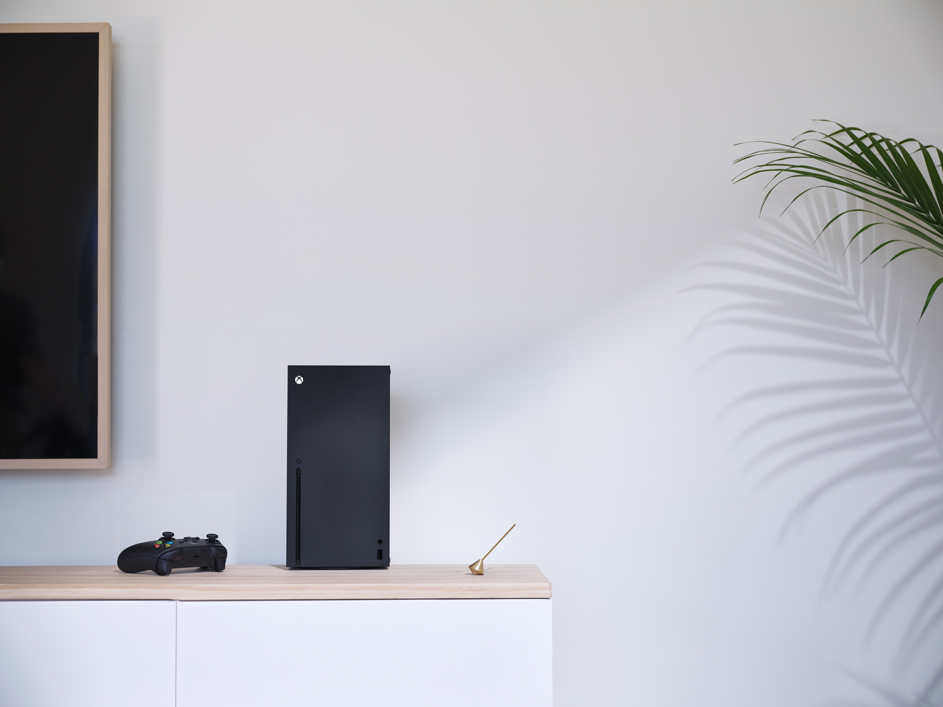
The result of all this? Incredibly high-tech devices that don’t look complex or intimidating. The designs of the Xbox Series X and Xbox Series S are meant to blend in with the environment around them, and the size and form factor of the devices are meant to adapt to the setup you already have.
“We want to build products that people will keep in their homes for years; by creating a silhouette that is quiet overall and surface finish that looks and feels friendlier than most consumer electronics, we believe the device has permission to be in living rooms and other parts of a home without feeling foreign and obtrusive,” said Ledbetter. “As designers we want to create products with visual impact, but realize that gamers buy an Xbox to play games, not just to look at; we don’t want the console to distract from that experience.”
As always, keep an eye on Xbox Wire for more details on Xbox Series X and Xbox Series S in the coming months as we continue on our road to launch.
Related:
Halo 3: ODST Now Available for PC with The Master Chief Collection
Destiny 2: Forsaken and Shadowkeep Available Today with Xbox Game Pass
Introducing Our Launch Line-up of Next-gen Xbox Accessories, Coming November 10


